
Neighborhood council members are missing out on being able to access a parking data tool that could allow them to make better informed policy decisions. The tool was confusing and not being utilized, so we improved the user experience to be more intuitive and valuable for collecting data that can inform parking and transportation policies.

In the City of Angels is a program called “Hack for LA” in which civic-minded volunteers rally their spirits and skills to manifest dreams into reality–one digital project at a time–under the partnered effort of community partners and local government officials.
One of the project efforts includes Parking Insights, which is a live data visualization view of parking data to better inform citizens of the effects of parking policies on a neighborhood by neighborhood basis. For example, community members can actively use the tool’s citation data and activity to create and define parking policies as they impact neighborhood to neighborhood.

In order to get acquainted with the project quickly, our team started off with looking at the website’s functionalities and assessing it against the general principles for interaction design.
Ultimately, we identified lots of issues with the site including the following:
Based on our assessment, we surmised that end users would be experiencing confusion, thereby diluting the program’s anticipated value.
Working closely with a design research partner, we connected and conducted 5 qualitative interviews and generative usability tests with a variety of users including neighborhood council members, engaged citizens, and those that are involved in working at non-profit organizations.
From our interviews, our team synthesized the following pain points:
Issues with the beta site:
Insufficient Context
Unclear that the website is related to parking data and not avoiding parking tickets. No clear information hierarchy. Data windows are poorly labeled.
No Collective Neighborhood Data
There was no way to select a neighborhood district or zip code on the map to find citation data. Collective data (what users want) can only be accessed using a custom polygon creation tool that drops anchor points.
Irrelevant Information
Individual data points on parking citations don’t seem to be useful to our users, but this is the most salient thing on the map. Users wanted quick information on the area surrounding an address.
No Ability to Compare Areas
Current product only lets users see one data set, but users want to compare neighborhoods and other regions.
As a result of the research effort’s findings, our team created user stories, user flows and mid fi wireframes to include the following changes:


Were our design proposals just a pipe dream or would they be helpful to real-time users? After creating a mid-fidelity prototype, our team tested with 5 people to better understand if we were heading towards the right direction. As a result, we iterated on two main key design decision points:
Users were confused by being able to change map boundary types on the left side of the screen while being able to search for places and select dates on the right side.
More than half of users used the Search Bar first rather than starting with Region Type.

Users were confused by the number of options available to find their data and had too many clicks to complete.

Users have 3 simple options at first.
- Search Bar
- Draw
- Compare Mode
Selecting an address or a place focuses the map, and brings up data for a given radius around the location.
Selecting a zip code or neighborhood council bring up these boundaries on the map,
Date ranges are preset to 1 year and appear in the data window after a region has already been selected.


Users had no idea how to use a polygon tool, and did not believe a polygon would be useful for the kind of customizability needed for the usability task.

- To match their mental models based on websites like Zillow and Reddit, we changed the polygon tool to a freehand Drawing tool.
- Drawing button has the word “Drawing” rather than using just an icon.
- Drawing Mode has clear instructions on the map. Users can use search bar find a location to focus map.

Users were not aware that they could compare regions off the bat.

Put a "Compare Mode" button on the initial state of the side bar, which brings up a structured step by step modal to find two regions to compare.

Users were disoriented and weren’t quite sure that they were now in a Compare Mode with a minimized sidebar.

We pivoted by using a modal that stays up during the region selection process. The user is walked through different steps until they have selected two regions and a date range.


Our users expressed interest in a view more similar to their existing experiences with other data platforms like Google Maps, Zillow, Redfin, and others. As a result, our team conducted a competitive analysis of comparative data sites including Social Explorers, Mapbox, and the US Census website. Based on our, we think we'd make the UI map feel more consumer friendly like Google Maps, Waze, and Redfin.
As part of improving the UI, I wanted to get consensus on the personality and values of the product with the entire team 1 Product Manager, 3 UX Designers, 2 Data Scientists, and 2 Developers.. I took the initiative to lead our group to work on two exercises from Google's Branding Sprint:
We started off with a fun exercise that explored values and beliefs of the project. Common themes included: Social Justice, Data Accessibility, Empowerment, Informed Policies.

Next, I lead the group to do another exercise that dove deeper into what everyone’s perception of the brand is. Overall, we thought it should be light, friendly, non-elite, simple, somewhat professional, and somewhat fun.

The insights derived from the workshops above impacted heavily on the UI and the design system, which tied in nicely with the feedback we received from numerous user interviews with our customers.
My role in this next phase of the project was to set up a Design System, including the foundations such as the colors, typography, logo, and reusable components. I wanted to move our visual design away from the current dark mode to achieve a lighter, more hopeful tone.
Our main color is blue, which is friendly but reliable. I chose Open Sans as a font that’s crisp and simple enough for data visualization but not overly utilitarian.

For the logo, I wanted to create a representative symbol that is informative but friendly. I chose to break the letter P up by using negative space, which looks like streets and is symbolic for the mathematical symbol of inequality (≠). This website, at its core, is a way to uncover inequality in different neighborhoods

One of the biggest challenges I faced with this project was to make a prototype of an interactive map, because there was a lot of customization we needed to do in order to get ideas across. Specifically, to create a good prototype to properly convey the design, I wanted to create custom styled map images that:
To achieve the above goals, I first needed to learn MapBox, a map API that was to be used by our devs.
The default map colors and number of elements would have clashed with our color palette, and needed to be toned down for our design.


For our design system, I created a color palette for map items like water bodies and green spaces.
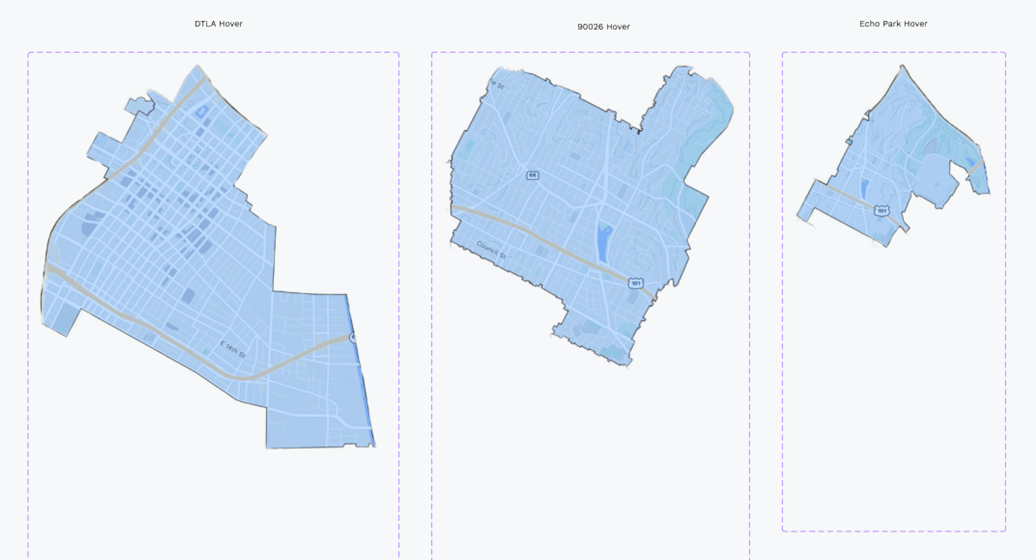
Next, I brought in city data to Mapbox and styled them to create boundaries to use for our maps:


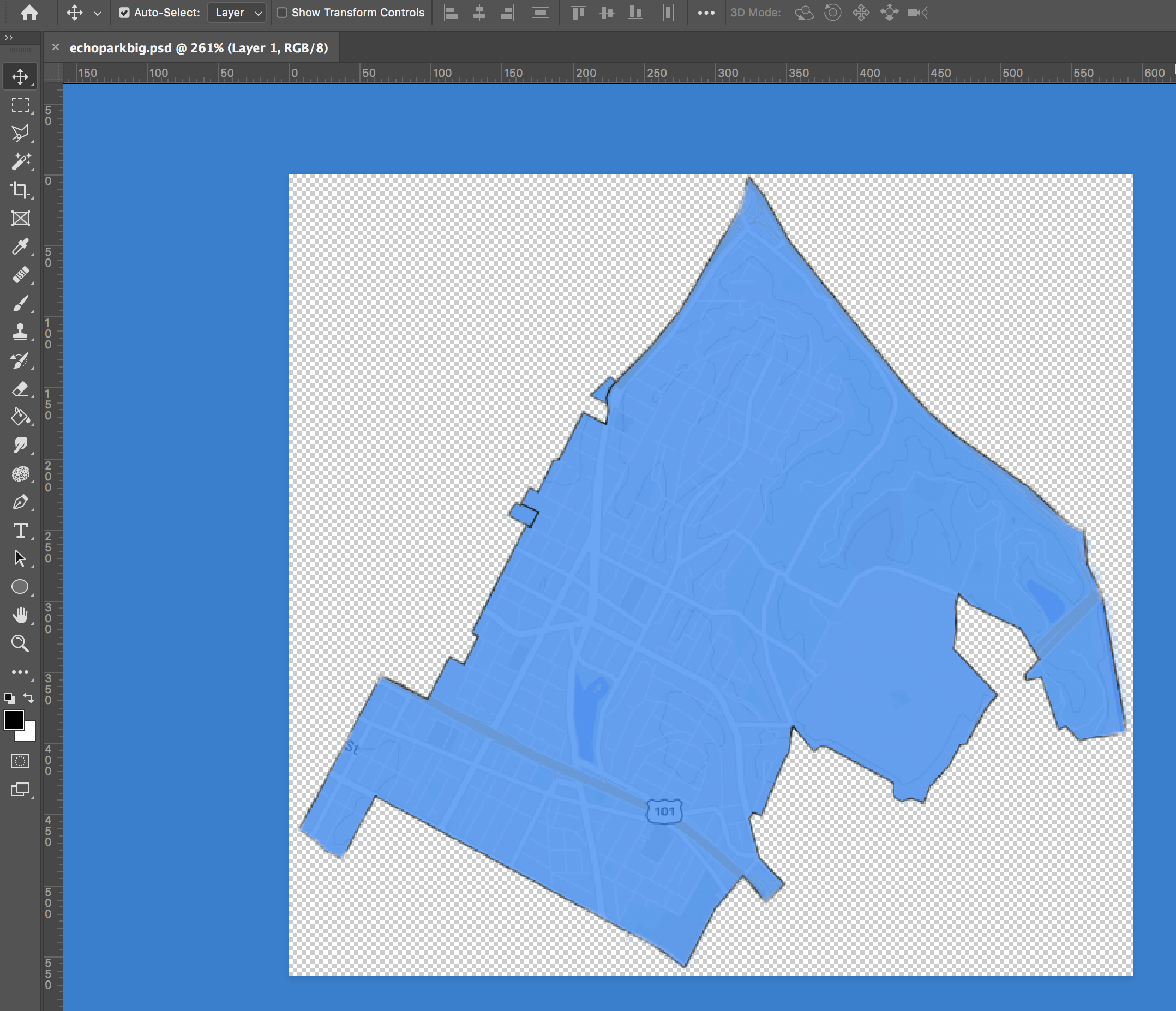
I also used Photoshop to create images to show hover states as components for the Figma map prototype
Finally, I used the maps and components in Figma for the moveable, clickable map prototype
My goal was to design an easy and user-friendly way to help local council members and engaged citizens accomplish their goals of finding data to inform their parking and transportation related policies. Below is a look at the key features of the final build.
Our users were unfamiliar with data sites that have complicated flows and controls all over the screen.
I designed a simplified side bar with consolidated controls for searching in order to reduce friction.

In the search bar autocomplete list users can select their result, and the region type (zip code, neighborhood council, place) is displayed.

To simplify the flow and reduce the number of steps, the data window has a preset date with quick pick ranges.
Charts and graphs have updated UI with relevant categories based on interviews with users, including citation densities rather than just totals.

Users a way to see data on pre-set boundaries, like zip codes and neighborhood council districts. After searching/selecting a neighborhood council, the map changes to show these boundaries and gives users data for the council district.
The map shows all the neighborhood councils, which are active and clickable.

Users wanted quick information on the area surrounding an address or place. In order to achieve this, I updated the design so that searching/selecting an individual map point creates an adjustable radius around that location.
Users are given data for this area and can drag the radius or change by inputting miles or feet.

In order to address the need for data on very specific and local areas of varying distances, I designed a custom draw tool to let users get data for whatever boundary they draw on the map.
This updated a clunkier and more confusing polygon tool that would be more intuitive and match user mental models. Users can either start drawing right away or search for a location to focus the map.

Users expressed wanting to be able to compare two different areas in order to see any similarities or inequality. I designed a “Compare Mode” where users can select a region type (neighborhood council, custom drawing, etc) and compare two areas.
Based on user feedback, I also included a progress indicator to walk users through what could otherwise be a confusing process.

While the updated high-fidelity concept is currently being developed, we plan to expand the project scope to include an app and a widget that will be embedded on individual neighborhood council websites.
Most recently, I have been meeting with development to facilitate a smooth handoff. Due to limited budget constraints, we do not have ample analytics tool to reference, once I am able to record metrics/data, I would love to observe the following:
To confirm that our users are visiting and using the site now that the tool has been redesigned to be more useful for are target audience.
To assess difficulty of features like getting comparison data for two areas
To confirm that our users are using our site in the intended way as well as to uncover any new pain points.